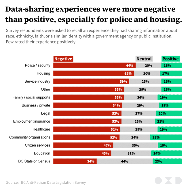
I produced this stacked bar chart for a Makeover Monday post where I redesigned a stacked bar chart from a report/presentation that consulting firm OXD prepared for the Government of British Columbia.
The original chart did not have deliberate ordering, which made the chart more difficult to read. I also rearranged the sentiment scale to focus on negative appraisals, since this was the big takeaway. It also used shades of red and green that don’t work that well together for colourblind readers.
I attempted to duplicate OXD’s style. Title font is Source Serif Pro, subtitle font is Source Sans Pro. Their original chart labels were in Helvetica, but I substituted this for Arial (don’t @ me).

