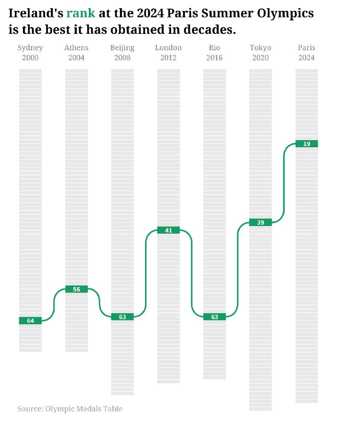
I made another attempt to visualize the data that I remade in this Makeover Monday post and ended up with this ‘single-series’ bump chart.
I like it more than the step chart remake, and the original line chart. Each column is a different size because the Olympic Medals Table only includes countries that win at least one medal (and therefore ‘rank’ on the table). I think it handles the large swings in rank quite well – an ordinary bump chart with many series plotted would not be readable, but this adaptation really puts the rank into context.
It was made by producing a bunch of stacked columns in Excel. The rest was done in Illustrator.

