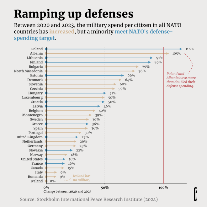
I produced this arrow chart for a Makeover Monday post where I redesigned part of an excellent chart by Yanika Borg of the European Correspondent.
This arrow chart was made completely in Excel, which was fairly tricky and time-consuming. I hadn’t made an arrow chart in Excel before, so it took some thought to figure it out. I started with a lollipop chart (which is itself a hacked scatterplot) and went from there.
Some of the contrast ratios aren’t up to snuff, and not all of the lines are strictly necessary, but I was attempting to duplicate the European Correspondent’s style.

