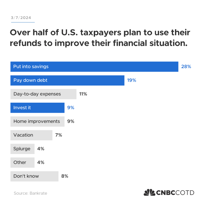
I produced this bar chart for a Makeover Monday post where I redesigned a donut chart featured on CNBC’s Chart of the Day. The donut chart had too many categories and obscured the finding in remake’s title.
Bar charts are some of the simplest out there, but sometimes simplicity is the most effective way to get the point across.
For this chart I was attempting to duplicate CNBC’s style. CNBC officially uses Gotham as their primary typeface, but I used Metropolis (a free alternative that’s pretty close).

