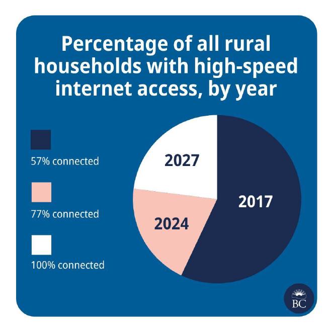
A friend linked me to a pie chart published by the Government of British Columbia on Instagram because they weren’t sure if they were interpreting it properly. The confusion was certainly warranted. My first reaction: “Is this a parody account?” That’s not the impression you want your dataviz to have.
Original #

Problems #
I think I can see what they were trying to do. The pie could be interpreted as getting ‘fuller’ with each year. This concept could have worked better with a multi-layered donut chart, or by using progressively darker shades of gradient palette. Either approach is going to take too long to interpret.
From top to bottom:
- The title is vague and descriptive. It sounds like it came straight out of a scientific paper. The title should get straight to the point, especially on social media. Our eyes shouldn’t need to go back and forth over a chart so we can figure out the message on our own. You’re the analyst – tell me what you found.
- The legend category labels and the pie slice data labels appear to have been swapped. This would make the chart more difficult to interpret even if the rest of the chart was executed perfectly.
- The pie adds up to more than 100% and the slice proportions don’t appear to match the data. I don’t mind pie charts (a controversial outlook), but they are best used to demonstrate parts-of-a-whole relationships with only a few categories (maybe two or three). This chart makes it appear that 2017 had a greater value than 2024 and 2027 combined.
- The source of the data isn’t attributed. Where did the information come from? What’s the basis for the 2027 prediction?
Remake #
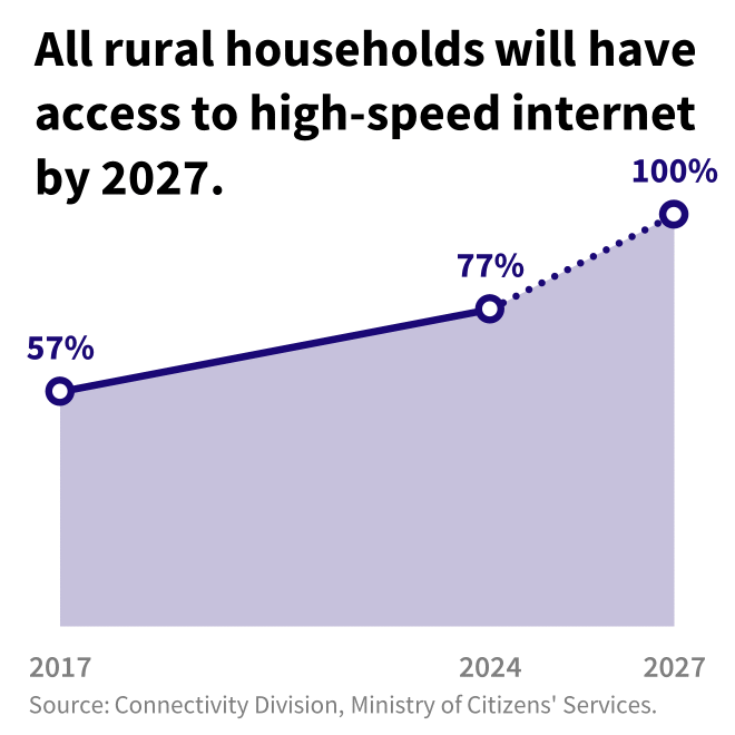
When I remade this chart I wanted it to be as simple as possible – we’re targeting a government social media account, so you should be able to read and understand it quickly. I used large text and bold lines to ensure it could be seen easily on a small screen. I didn’t try to match the Government of British Columbia branding, but instead aimed to focus the message of the visualization (this was originally presented to a different audience).
Let’s take the changes step by step:
- First, I converted it from a pie chart to an area chart. A line chart would do just as well, but an area provides a bit more visual interest than a single line. The trend is now pretty obvious: the percentage is going up with time.
- I tossed the descriptive title and replaced it with the main takeaway: “All rural households will have access to high-speed internet by 2027.” In this case it might be a goal or prediction, but this is the main message they want the audience to leave with. Now, if you only have someone’s attention for a few seconds at least they’ve heard you before scrolling away.
- I directly labeled the data points with their percentage value (not the year!).
- The years are not equally spaced, and the axis reflects this. Too often I see line charts without equidistant axis intervals.
- Projected data points are differentiated from observed data points using a broken line. We don’t actually know what percentage of rural households will have access to high speed internet in 2027 – this is years from now.
- I found and provided the source for the information.
Much more effective, right? Don’t use pie charts to show change over time, they have a bad enough rap as it is.

