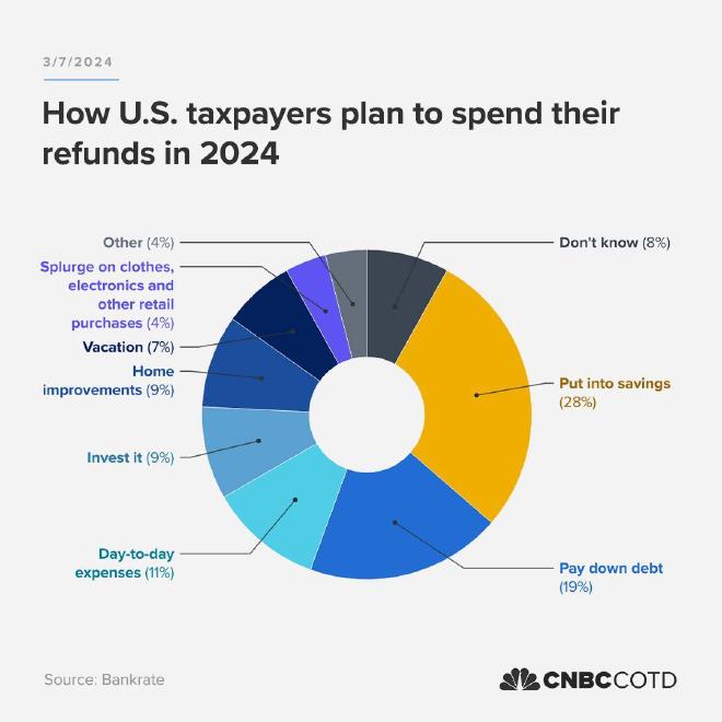
I came across this chart just browsing Instagram and thought I could do better. The gold colour of the “put into savings” category calls attention to it quickly (“wow, only a quarter of Americans plan to save their refund?!”), but there’s a larger story here.
Original #

Problems #
This donut chart is just trying to do too much.
- There are too many categories for a donut chart, making them difficult to compare at a glance. I’m relying a lot on the labels to read the chart, but…
- The labels are crowded. For some, there’s too much distance from their donut slice. Why does one of them break across four lines?
- Pies and donuts are typically read from the top (12 o’clock) in a clockwise direction. Why are we starting with the “don’t know” category?
- The title is descriptive. Thankfully it doesn’t read like a chart title in an academic paper, but it should point to something interesting. Why are you making me figure out the finding on my own? Why did you bother visualizing this?
Remake #
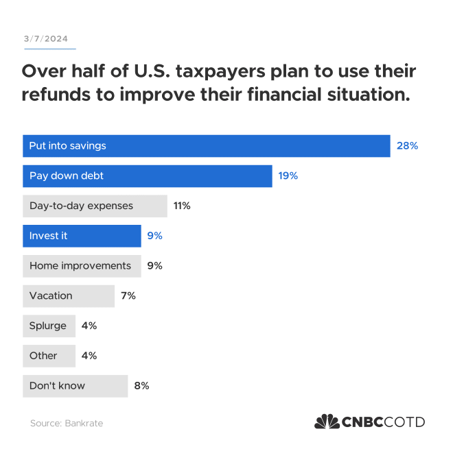
We’ve all seen hundreds of bar charts. They’re basic, and this can work against them sometimes. But they’re also really easy to interpret. Comparing categories is as simple as figuring out which line is longer. So what if our data is parts-of-a-whole? It’s a great chart to use with survey data when we have a whole lot of small options and a few dominant ones (we don’t want a lot of large bars).
My changes:
- Obviously I transformed the donut into a bar chart. The categories are way easier to compare.
- I simplified some of the labels. Often the language we use in a survey is not the ideal language for presentation. We’re not substantively changing the meaning by shortening the label, here.
- That said, depending on the audience, it can be a good idea to have more details on demand. Academic audiences, for example, tend to be more interested in exactly how the question was asked!
- The title now points to a finding of interest. There were multiple categories related to improving one’s financial situation (all of which easily fit into a typical financial planning strategy), and this seemed way more important than highlighting “saving” only. Only 11% of taxpayers planned to have fun with the money.
- I simplified the colours to reinforce the point and draw the eye toward the financially-oriented categories.
- I prefer to put “other” and “don’t know” at the end. They’re usually small categories and tend to be the most difficult to interpret.
I’ve seen donuts with two toppings before, where maybe half is caramel and half is chocolate. Sounds too rich to have on the regular, but you’ve got to indulge now and then. Hypothetically, even three flavours might be nice. Four different toppings – one for each quarter – is pushing it. Let this guide your donut chart usage.

