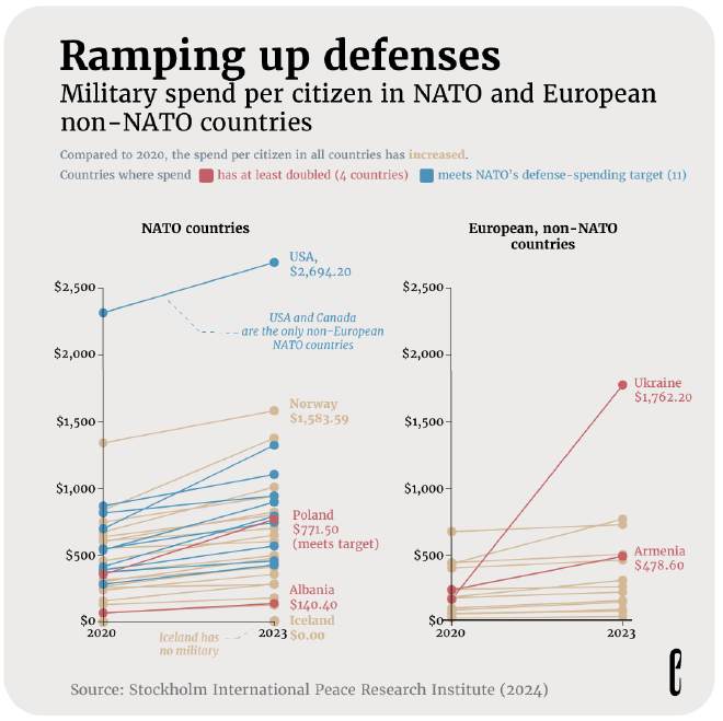
I saw this excellent slope chart from the European Correspondent while browsing Instagram, and wanted to remake the left side. Slope charts are great at demonstrating the direction of change, and this chart certainly makes the point that spending in (nearly) all countries has increased (not you, Iceland). The problem with slope charts is that they aren’t great at displaying relative change, especially when comparing vastly different quantities.
For example: in the following chart, the United States has one of the steeper slopes, but its spend per citizen was already quite large. That’s something like a 17% increase. Albania started and ended with a fairly small spend per citizen, and the line looks almost flat – but it more than doubled in three years! Since countries have different economic circumstances and starting points, surely both the absolute and relative change are important here (especially with so much rhetoric about certain NATO countries not “pulling their weight”.)
Original #

Problems #
All things considered, I thought this was a pretty solid chart, so my goal here isn’t so much to “make over” the chart, but to tell a fuller story by adding to it. Even though the original is measuring per capita spend, it hides the magnitude of change for countries that began with lower spending (and any comparison to the United States’ military spending is going to be tough!).
There are some issues I’ll note here, though:
- The takeaway message is in small text below the title and subtitle, and could be more prominent.
- The palette colours don’t provide enough contrast. Light yellow text on a grey background is pretty hard to read, and the European Correspondent does this in so many charts!
I won’t be fixing the palette issue this time, since I’m going to attempt to duplicate their style, but want to note it in case anyone from their (excellent) data visualization team ends up reading this (fingers crosssed).
Remake #
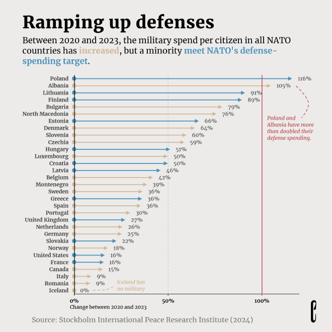
So, a ton of categories and a focus on relative change. This could have been something like a lollipop or dot plot (which from a baseline of 0% are nearly identical). But I wanted to try something new.
A rundown of the changes:
- I calculated the percentage change and converted it from a slope chart to an arrow chart. Arrow charts are particularly good at displaying relative change, and the arrows make the direction of movement easy to understand. I don’t see a lot of arrow charts, but they’re very similar to a comet chart. I like their clean appearance when dealing with many categories.
- I really liked the main title, so I left it. It’s very much the European Correspondent’s style to have a “catchy” title with the takeaway in the subtitle. However, this chart had a generic descriptive subtitle, with the takeaway in small text below the subtitle, so I moved the takeaway into the subtitle.
- I removed the legend and integrated it into the subtitle.
- I added a dotted gridline at the 50% mark, which helps ground the arrows.
- I added a red gridline at the 100% mark (finish line!) which calls attention to the secondary finding (some countries doubled their spending) without obscuring whether countries are meeting NATO’s spending target.
I made this chart in Excel with no post-processing. I had never made an arrow chart in Excel before, and I’m not aware of any good tutorials on how to do it, so it was a bit tricky and time consuming to figure out a good approach. I started with a lollipop chart (which is itself a hacked scatterplot) and went from there. Even so, it took some thought and a lot of Ctrl-Z. I’ll definitely write a tutorial based on this experience.

