I was doing some digging on measures of mental wellbeing for a survey development project (it’s always good to stay up-to-date on current measures) when I came across a report on the impact of COVID-19 on the mental health of Canadian post-secondary students. This was jointly published by the Mental Health Commission of Canada (MHCC) and the Canadian Association of Colleges and University Student Services (CACUSS).
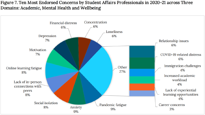
Visualizations from government reports and academic papers tend to be pretty bad, and this is no exception, but I don’t want to criticize their work for criticism’s sake – I want to help them improve! I found one chart that was particularly egregious: a pie and column. Let’s take a look.
Original #

Problems #
I’m not anti-pie-chart, but this is definitely not an appropriate use of a pie chart. Where to even begin…
- A pie chart should not have this many categories. Two or three categories is fine, four tops.
- Our largest category (aside from ‘other’) starts at a seemingly random angle to accomodate the ‘other’ column breakdown. Your first slice should start at 0 degrees. And if you need a second chart inside your chart just to finish visualizing a distribution you probably haven’t made a good chart choice.
- The title is completely descriptive and ‘academic sounding’ – there is no clear finding. This is a report to the public, not a scientific paper in a peer-reviewed journal. Tell us what we’re really looking at and why we should care.
- Each category actually belongs to one of three distinct, overarching themes (academic, mental health, overall well-being), but there is no indication of this in the visualization.
- There are too many colours, and it’s hard to tell where we should start looking. I’m drawn more to the ‘other’ category and its breakdown, which is not where our eyes should be (at least to start).
- It’s a little hard to see from the screenshot, but there’s a border box around the chart which prevents it from looking like an integrated part of the report. This is not a standalone viz, so we shouldn’t be trying to separate it off from the rest of the content. It should be part of the report flow.
My biggest gripe is that the authors transformed the data in a confusing way in order to make it sum to 100% to fit a pie chart (credit where credit is due: at least the pie doesn’t sum to 960%). Instead of visualizing the percentage of student affairs professionals who ’endorsed’ each concern, they essentially summed up all of the concerns and visualized the percentage of that new denominator. We end up with a situation where ‘pandemic fatigue’ makes up 9% of endorsed concerns, which looks pretty small considering it was endorsed by 87% of the surveyed student affairs professionals!
The original data they presented looked something like this:
| Academic | Mental Health | Overall Well-Being |
|---|---|---|
| Lack of in-person social connections with peers: 77% | Anxiety not directly related to COVID-19: 84% | Pandemic fatigue: 87% |
| Online learning fatigue: 77% | Social isolation: 83% | Financial distress (or concerns about finances): 64% |
| Motivation (e.g. difficulty getting started, staying motivated, completing work): 70% | Loneliness: 61% | Relationship issues with family, friends, romantic partners: 59% |
…and so on. It is actually possible to visualize this sort of ‘multiple-selection’ data. In fact, it’s pretty easy. And easier to understand, too.
Remake #
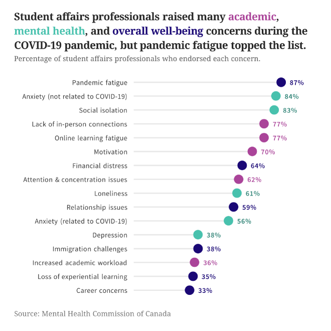
I opted to scrap their data transformation and visualize the original table.
- I converted the chart from a ‘pie and column’ to a lollipop chart. A lollipop is an excellent choice when you need to rank multi-select survey question options, and it’s much easier to read than a bar chart when you have a high number of categories with high numbers. This avoids the ’too much ink’ problem bar charts sometimes have. There’s not a lot of colour, and this ensures that the coloured dots grab attention quickly.
- The title has a point. There’s actually a finding we’re being pointed to, even if it’s pretty obvious.
- Instead of random category colours, I used only three colours to code each category, showing its relation to the three overarching themes. Instead of a legend, these three theme colours are integrated into the chart title.
- I got rid of the border line.
The report did not have a clear style to duplicate, so I went with a very simple report style. The viz should complement the rest of the report, not overshadow it. For typeface, the title, subtitle and source use Noto Serif, and other text uses Source Sans Pro.

