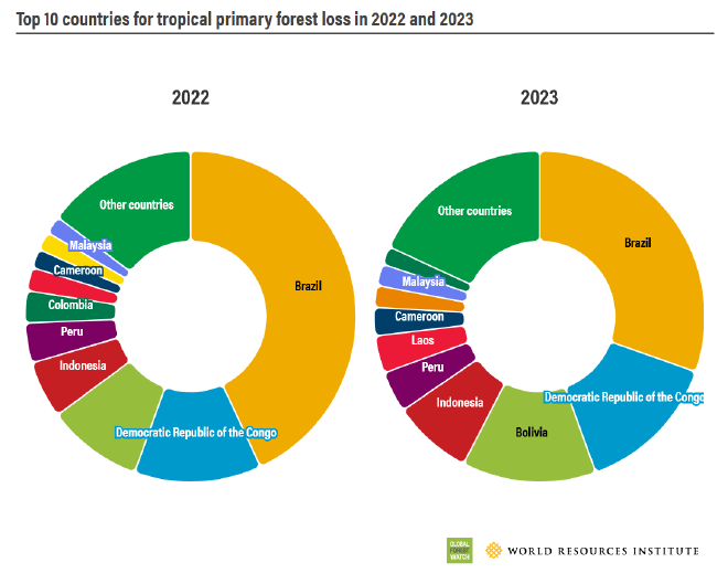
I stumbled upon this donut chart by Global Forest Watch, which is a project of the World Resources Institute. If you’re not familiar with Global Forest Watch, they do a lot of dataviz related to forest cover, deforestation, forest fires, and climate change, much of which can be found in their dashboard. They also publish the annual Forest Pulse report, which covers forest loss over the last year.
They posted this chart to their Instagram page, and one user was confused about what was actually being measured. I’m hoping this makeover can give some clarity to the message.
Original #

Problems #
Oh dear, more donut charts. And this time, they’re being used to make a comparison over time. Yikes! Donuts are not a great choice for that. Let’s break it down:
- First, as mentioned, it’s not clear what we’re measuring. What is ‘forest loss’? Our audience probably aren’t experts on the topic. I’m certainly not, yet this content was recommended to me. If Brazil’s forest loss went down in 2023 does this mean Brazil’s forests recovered? Or does it only mean they lost less forest that year compared to the year prior? (Hint: it’s the latter)
- Donuts are proportional. Did forest loss decline in Brazil, or did it just increase that much more in other countries?
- The title is super vague. Without the context of the full report, it’s not difficult to think of a bunch of ways to interpret the chart (as in the above two points). There is a point, but it’s in the Instagram description and the report body. It needs to be made explicit for scrollers and skimmers.
- Too many categories, too many colours, the labels are hard to read, and so on. The usual donut/pie problems.
Remake #
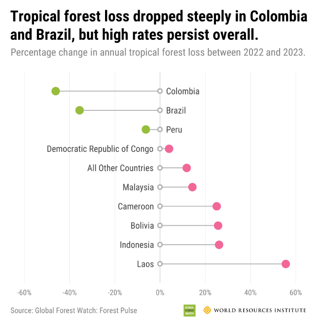
The Forest Pulse report and the accompanying Instagram post (at least, the description) were emphasizing the huge declines in Brazil and Colombia’s annual tropical forest loss. Brazil’s annual loss is still very high, but there’s effort and it’s paying off. This is the message we want to sharpen.
- Instead of using raw numbers, I’ve transformed the data to show percentage change. For this topic, the raw numbers do seem to be very important, but the point of this chart seemed to be to show which direction different countries were moving. Brazil is a huge country with a lot of forest cover, and subsequently a lot of loss, but they are working to reduce that loss. Laos is a smaller country, but its forest loss is accelerating – even though its annual loss is still well below Brazil’s. Percentage change allows a fair comparison; we can easily see where forest loss is improving and where it’s getting worse.
- This is a case where I’d ideally show both absolute and relative change. The original report does a pretty good job with absolute change, so I’m only focusing on sharpening the relative point.
- I convered the chart into a lollipop, and ordered the countries from low (negative) to high (positive). This creates a nice division between the improving countries and the worsening countries.
- I put the main finding right in the title. This is actually borrowed (and slightly modified) from elsewhere in the original report.
- I use the subtitle to clarify what was measured. It’s the change in annual loss, i.e. whether the amount lost in 2023 is more or less than the amount lost in 2022. I would test this with a few people who aren’t as stats-savvy and make it plainer if necessary, though.
The remake is far less ambiguous to interpret, it’s way quicker to read, and you don’t need to spend any time fishing for the message.

