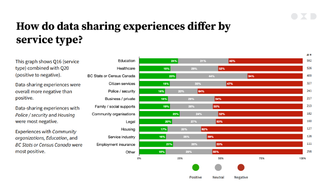
I found this stacked bar chart by Vancouver consulting firm OXD while working on another project. Since they do design consulting, OXD’s visualizations are usually pretty good, but I found this one took too long to read.
The visualization comes from the Anti-racism Online Engagement Report OXD developed for the Government of British Columbia. This viz doesn’t need a complete overhaul, but we can definitely do some work to sharpen the message.
Original #

Problems #
A stacked bar chart like this is actually a pretty good choice for the kind of survey data they’re presenting. That said, there’s a few things I notice that we could improve on:
- The title doesn’t give us any clear takeaway, other than experience varying by service type. Posing a question is better than something like “Data Sharing Experiences versus Service Type” though. At least it gives us a clue of what we should look for.
- The written points do point us to the big takeaway (sharing experiences are more negative than positive, and especially negative for police and housing). But it references survey question numbers, and no one but the analyst who dealt with the survey is going to remember exactly what those mean.
- Our finding is that experiences are likely to be negative, but the chart is focusing more on the positive experiences by placing those first.
- The agency/institution categories aren’t arranged in a meaningful order. I would guess this was the survey order. Our eyes have to jump around too much to compare the categories, and it’s hard to rank all but the largest and smallest values.
- The legend seems out of place. We could bring the legend marks closer to the categories they represent and make it more intuitive.
- Red and green together is usually a bad idea. These shades of red and green in particular are fairly close in colourblindness simulations.
- The white data labels have poor contrast against the green and grey bars.
Remake #
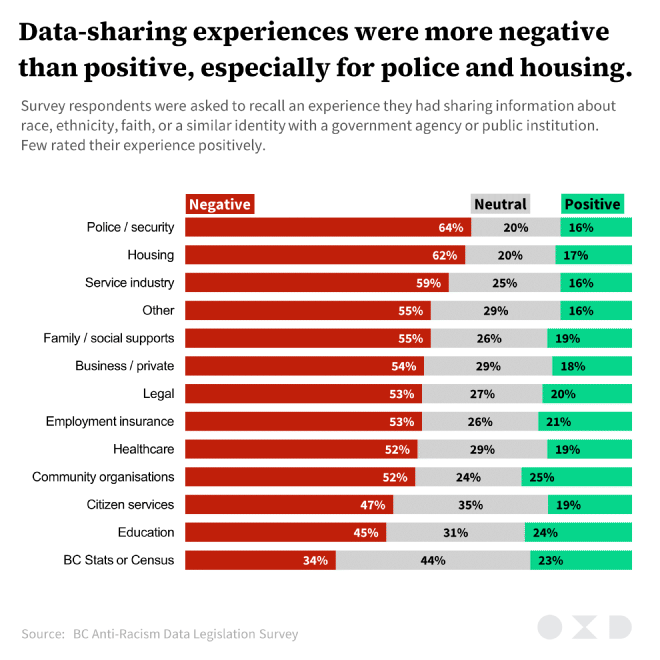
Again, I focus on sharpening the message, as well as making the chart a bit more accessible.
- I put the main finding right in the title. Basically just shortened some of those written points and moved them to the top.
- The subtitle deals with the question number issue. I just summarized what was asked for the reader.
- I swapped the order of the sentiment categories, so we’re moving from negative to positive. Since the majority of experiences were negative we draw more attention to this. That’s kind of a huge finding to want to communicate, given the survey’s aim of improving ethnicity data collection!
- I sorted the agency/institution categories by negative sentiment (and then by neutral sentiment). Now the worst agencies or institutions to share data with are at the top (and presumably they get better as we go down).
- I split out and transformed the traditional legend, instead directly associating the labels with the bars. Now our eyes don’t need to dart around to the edge of the chart. No, it’s not intuitive that red means bad (this kind of symbolism is not even close to being culturally universal).
- I modified the colours, keeping the original red but lightening both the grey and green so the red has the most emphasis. I also added more blue to the green to help colourblind readers differentiate it from the red.
- I fixed the text contrast on the grey and green bars (they now use black text instead of white).
- I removed the vertical axis line and the horizontal axis labels. They were redundant chart clutter.
Same chart, easier to read. And we don’t need to squint at tiny text on a slide deck to get the main message.

