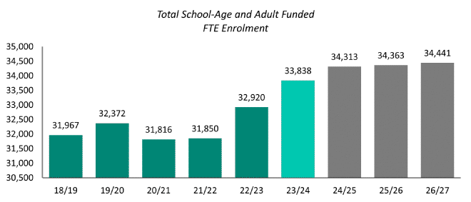
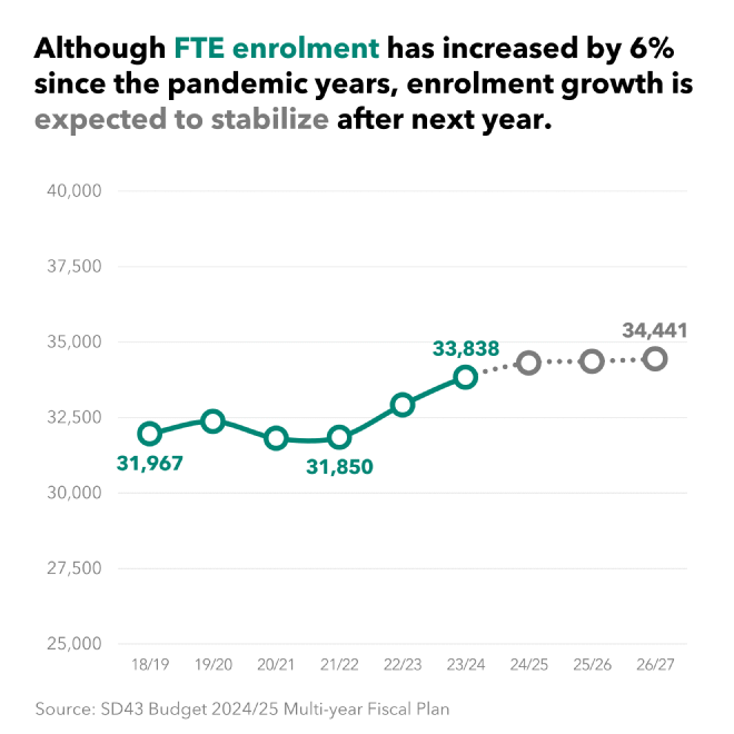
I came across these enrolment projections from BC’s School District 43 (aka SD43) while working on another project. School districts are usually pretty bad at data viz, but really, who can blame them? It’s not like kids won’t go to school just because the district doesn’t have a clear communication strategy, and budgets tend to be on the tighter side.
The visualization I remade comes from SD43’s Budget 2024/25 Multi-year Fiscal Plan. For context, it’s mandatory for school districts in BC to submit enrolment projections as part of their budgetary and accountability framework.
There’s a lot of hard-to-read viz in the Fiscal Plan, but I’m picking on this one because of a major flaw.
Original #

Before jumping into what’s going wrong, I want to focus a bit on what’s going right. Someone at SD43 is trying, and, aside from the aforementioned flaw, this viz is actually doing a lot of things right in terms of improving readability. I’ve definitely seen a lot worse. I’ll give credit where credit is due.
- They cleared some chart clutter by directly labelling each bar and removing the gridlines.
- The bars are a good thickness. There’s enough whitespace. Each year is easy to compare. I can see the trend easily.
- Good use of colour! They used a limited palette to focus our attention. The current year is highlighted, and a muted grey is used to differentiate the projections from the observed data. Very nice!
Problems #
But wait… why does the 2022/23 bar look almost twice as tall as the 2021/22 bar? Enrolment certainly didn’t double. Ahh, there’s the rub.
You see, when we use a bar chart we’re visualizing and comparing length. Length is really easy to interpret, which is one reason bar charts are so common. It’s located high on Cleveland & McGill’s interpretation hierarchy, meaning it tends to result in few errors on the part of readers. But here, our y-axis doesn’t start at zero, so the length of the bar is only tangentially related to our data. So, the reader knows they’re supposed to be comparing length, but we haven’t actually visualized length, leading them astray.
There’s a lot of debate in the data viz community about whether the y-axis should always start at zero. This is particularly true for line charts, and some others, when you’re visualizing data for which zero may not even be a realistic value. But for those charts our visual cues tend to be position or direction.
For bar charts, the axis absolutely must start at zero. If this doesn’t work for you, use a different chart type. The non-zero bar chart y-axis has been cited as a manipulation as far back as 1954 in How to Lie with Statistics. Yes, it’s a tactic used to purposefully mislead readers. I don’t think that was SD43’s plan here, but they probably don’t want to be in the same camp as those who use dataviz for evil.
This problem overshadows everything else about the visualization, by a long ways. Normally I’d point out that the y-axis labels are unnecessary (since the bars are directly labelled), but in this case they actually help us identify that there’s a problem with the scale! The title is bland, and so on. You know the routine.
Also, I wouldn’t use Calibri, just because it was the Office default typeface for so long.
Remake #
So, we obviously need to change the chart type. Let’s start with that:
- I changed this from a bar chart to a line chart. The takeaway of this chart relates to the trend. We care about whether it’s going up or down. A line chart lets us see that without fundamentally being a manipulation. Zero isn’t a realistic value for FTE enrolment, and even relatively small changes are important (a 1% increase in a district this size is a lot of extra kids!), so it’s okay for us to display a ‘zoomed in’ view.
- On that note, I leave the y-axis labels in to indicate the view is zoomed. The axis range is reasonable, allowing us to see the trend without overemphasizing the ups and downs (even a line chart can be manipulative, particularly if we stick to default axis ranges).
- I don’t think it’s important that every data point in this visualization has a label, so I only labelled the important ones. This is okay, since we left those y-axis labels in. We’re left with answers to these burning questions:
- Where did we start?
- What was the pandemic impact?
- Where are we now?
- Where are we heading?
- I put the finding in the title, instead of using a boring description. Instead of using a separate legend, the legend information is integrated into the title.
- I used the same colours (teal for observed data, grey for projections), but tossed the current-year highlight (it’s not really necessary in the context of a line chart). The last three years are further emphasized as a projection via the broken, dotted line.
Remember, it’s okay for a line chart to have a non-zero origin if you have a good justification, and I think it suits this data.

