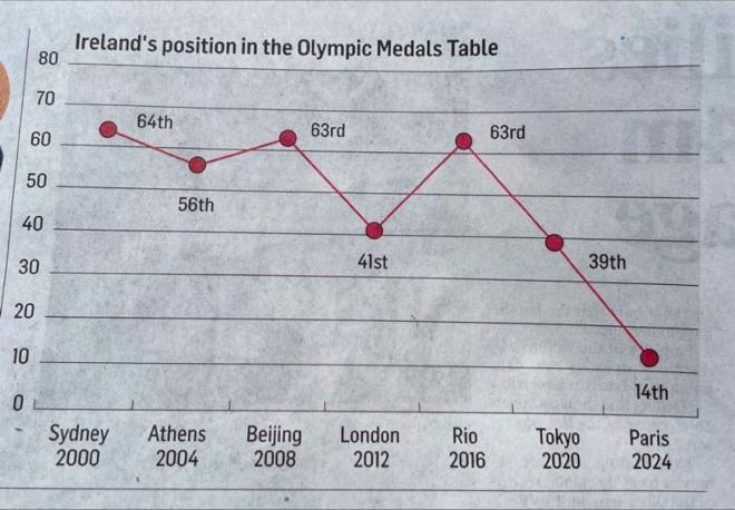
A friend sent me this line chart, presumably published in the print edition of the Irish Times. They had the same chart published on their website with corrected data, and have since corrected the y-axis direction. So props to them for making it a bit more intuitive.
We’re going to give it a few simple changes that will improve the readability by a lot.
Original #
Problems #
A standard line chart usually isn’t the best choice when visualizing rank. Some issues we can improve on:
- Y-axis direction. People are used to interpreting line charts like this: a line going up is increasing, a line going down is decreasing. A rank that is decreasing in value is increasing in position (we want a lower value), so the line should be going up between 2020 and 2024. The direction of our y-axis should align with audience expectations. It’s not a hard fix – it’s usually just a single check box to reverse y-axis direction in most charting software (and not much more difficult in anything code-based too). [To be fair, they did fix this by time I got around to writing this post!]
- The big problem with a line chart here is… the line connecting the data points. The line slopes to imply an estimation of missing data points: we can’t observe all events, and we’re sort of predicting what the value might be between our observations. This is why there’s debate over whether it’s appropriate to use curved/smoothed lines instead of straight ones – it all comes down to how we think the audience will interpret the line shape. In this case, we have observed all events for our time period. There are no Summer Olympics happening in between our existing data points that we’ve missed. But a sloping line connecting the points might be taken to imply, for example, that Ireland’s rank was 25th in 2022, which is nonsense.
- There’s a lot of chart clutter. Axis and grid lines, tick marks, and a y-axis label which isn’t really necessary since every data point is directly labelled.
- The title is bland and purely descriptive.
- The data for Paris 2024 is incorrect: Ireland’s position was 19th, not 14th (but it’s possible this was true at the time of publication so I won’t be too hard here).
Remake #
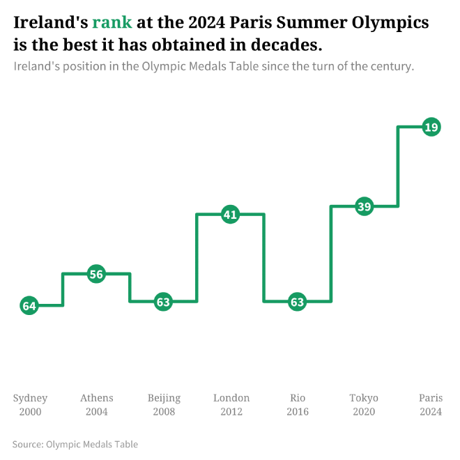
I’m not sure if there’s an immediately obvious chart type to use here, and I thought of a few different ideas before the final remake. Since our time series is really just a handful of points I can see the merits of a column chart or lollipop (one could argue this is totally appropriate since each observation could be considered a completely independent event, and this isn’t really a time series at all). However, this could be just as confusing, since we’d still need to invert the y-axis – awkward on a column chart. A bump chart could work, but that might be awkward given the large changes in position and the fact we’re only plotting a single series. In the end, since the ranking only ‘changes’ at distinct points, I thought a step chart would do the job.
- So, I converted the line chart to a step chart. Now the line only moves straight up, down, left, or right, to the next obtained rank.
- The y-axis is inverted, so lower values (higher rank) are at the top. Combined with the step line, this sort of creates the outline of a bar chart with inverted data. It also resembles a the shape of a winners podium or pedestal, which I think is pretty neat!
- The title now contains a finding, instead of being purely descriptive.
- Further clarified that we have plotted Ireland’s rank by integrating the line colour into the title.
- Removed unnecessary chart clutter.
- Fixed the final data point.
It’s possible there’s a better way to visualize this data; this approach just made the most sense to me at the time. If you can think of a better visualization, let me know!


