The more stuff we have in a chart, the longer it takes to read.
Whether you’re working with Excel, Tableau, Observable, or ggplot2, by default charting software tends to add all sorts of extra elements like borders, gridlines, legends, and extra labels.
In other words, chart clutter.
Sometimes these are actually necessary to interpret a chart, or can add a sense of cohesiveness.
Usually they’re just a distraction, and unless you’re writing an academic paper and heading off ‘Reviewer 3’, you should cut them. We can do a better job by integrating the information these elements provide elsewhere in our visualization.
No borders. #
When a visualization is part of something else, like a report, a border line separates it off. Like it’s its own thing.

If your report has visualizations they should be part of the story, not optional pictures we look at afterward.
Get rid of the border line and integrate the visualization so it feels like an essential piece.
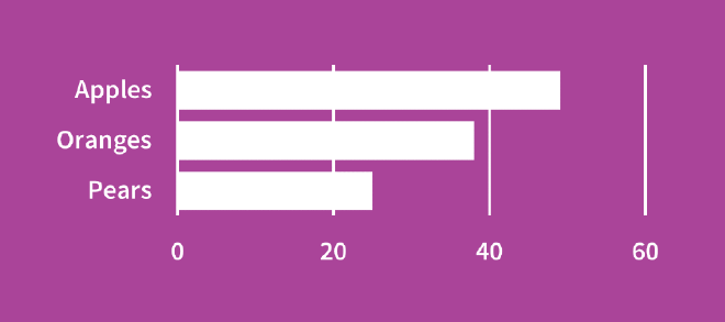
Directly label. #
Ever see a chart where the axis labels take up as much space as the chart itself? Or where you’re always going back and forth trying to estimate what the data points actually are?
Where possible, directly label your chart elements. Our eyes have to do less moving around.
It also tends to give the visual part of the visualization a lot more space and emphasis.
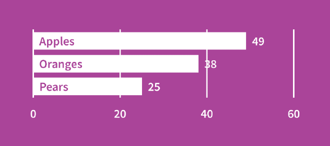
It’s okay to shorten the category labels to make this work, so long as it’s not changing the interpretation. Often the language we use to provide clarity to survey respondents isn’t ideal language for later presenting that data.
Toss the gridlines. #
When data are directly labelled, gridlines, axis lines, and tick marks serve no purpose. Get rid of them.
Very occasionally they can lend a sense of cohesiveness to a chart, but this might just be making up for poor design elsewhere.
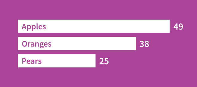
Our final visualization is much cleaner and easier to read, even without a title or other guidance.
Toss the legends. #
Legends require a lot of eye movement. It’s usually better to integrate legend information directly into the visualization. You can do this by directly labelling the data series.
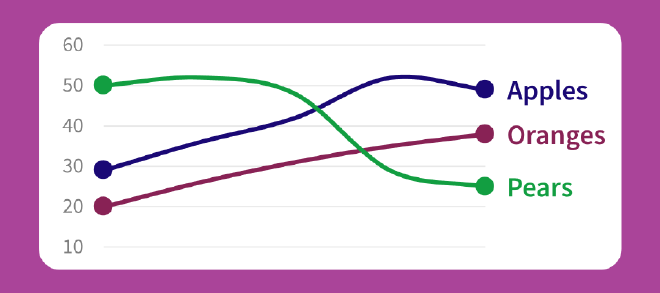
Otherwise, pushing the information to the title or subtitle is a good substitute that allows us to do more while using less space.
(Note that in the above figure axis numbers and gridlines are kept since they’re actually necessary to interpret the chart!)
Exceptional cases. #
It’s inevitable that you will encounter exceptions. Line charts are a big one where we often have many data points and can’t directly label everything – nor would we want to directly label everything, since we would be creating more distraction by calling attention to points that aren’t important to our message!
In such cases, de-emphasize the gridline and axis elements by reducing their size and using less prominent shades. This helps create a sense of hierarchy. It tells our eyes that these elements are less important, and allows them to be drawn to the more important elements first.
