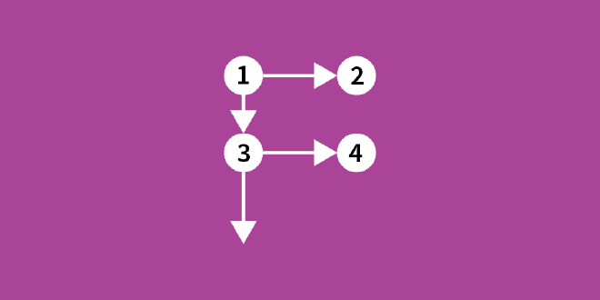
I recently attended a talk by Steve Franconeri of the Visual Thinking Lab whose big takeaway was that “reading a graph is like reading a paragraph.” Even though graphs are visual, we rely on slow cognitive operations to process them. Recognition is quick, but comparison takes a lot more time.
Eye-tracking research reveals that we approach graphs in much the same way we approach all-text content, scanning in predictable patterns, so it’s vital we call attention to what really matters.
Enter visual hierarchy.
Use reading paths. #
Be aware of common reading paths used by your audience. Western audiences tend to scan content in an F-shaped path, moving from left-to-right and then top-to-bottom.

Arabic readers tend to scan the opposite way, in a reverse-F shape. There are many other paths, depending on content and language. Again, be aware of your audience’s expectations.
Titles and axes are easiest to read when placed along these paths. It’s expected that content will align to these paths, and it can feel jarring when it isn’t.
You can disrupt reading paths purposefully to call attention to something important. In fact, you should disrupt it in this situation.
Use text sizing. #
Eye-tracking studies demonstrate that people tend to spend most of their time reading a chart’s text, rather than focusing on the visual elements.
The eye is drawn to the biggest text first, and progressively works its way down.
Make important stuff big, like the title with your main takeaway. All other text should be smaller than your title text. What else do you want your audience to see immediately? Make sure it’s prominent.
Make other key details smaller. Direct data labels are often important, but don’t need attention called to them immediately. Same with annotations.
De-emphasize all other text. Make it smaller and make the shade less prominent.
Use colour and shape. #
Colour and shape can be very effective at grabbing attention. Our eyes recognize immediately that something is different.

Use both sparingly to direct the eye and make comparison easier. When every element is unique we don’t know where to look. Help the audience focus on what is important.
Use whitespace. #
The feeling I get when looking at cluttered viz is a bit like when entering a cluttered room. Chaos doesn’t really help anyone.
Don’t feel the need to fill every bit of space in your visualization.
Crowded viz is unapproachable viz.
Space around important elements helps draw the eye to those elements.
Having ample space and few distractions gives your visualization a cleaner, more focused appearance.
