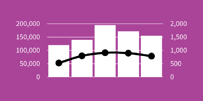
I frequently see charts with too many dimensions, 3D shapes, or awful tangentially-related clip art. Generally, artistic elements should be functional and we should avoid unnecessary complexity.
Now, complexity is fine. Often we simply fail at making complexity approachable.
Beauty is important (how else do we expect viz to catch the eye?). But it should be purposeful and coherent.
In other words, complexity and beauty should be by design.
Decorative elements should do two things for your visualization:
- Aid comprehension
- Capture attention
If they’re not pulling their weight, simplify. Let’s go through some common pitfalls to avoid.
No secondary axis. #
Sometimes you see charts with two completely different things. Not different categories, but different variables, sometimes mixing up different chart types (e.g. both bar and line charts). They do this with a secondary axis.

A secondary axis reduces readability.
It’s usually best to split these into multiple charts. Or create a better measure – if you have two variables that are fundamentally related, you should be able to do this.
Keep it to one finding per chart.
No 3D. #
We’ve known 3D charts are problematic for interpretation since 1951, but as long as they’re present in Excel we’ll continue seeing a lot of them. The big issue is that volume is very difficult to interpret accurately. Also, 3D charts are typically represented in 2D space, meaning our interpretation relies largely on perspective (our own position relative to the 3D object).
Let’s try it out.

The teal slice has the smallest value. Can you tell at a glance? It looks large in comparison to the other slices because it is closest to us.
Stick to 2D charts.
If your data has multiple dimensions, don’t try to shove it into a 3D scatterplot or line (or rather, plane) chart. These are not easy to read (the one exception maybe being if we can actually view the chart in 3D). Use faceting to break out the dimensions instead.
No clipart. #
Leave out artistic elements that aren’t an integral part of the visualization, especially clipart.
Your chart has empty areas and you don’t have annotations. So what? Whitespace is a good thing that actually helps aid the speed of comprehension!
At best, clipart distracts your audience from what you really want them to see.
At worst, it may damage your credibility.
Artistic flair should only be used if it’s exceptionally clever, cohesive, or aids comprehension.
No unnecessary animation. #
When I see an animated timeline my eyes glaze over in seconds. You know those bar charts that grow and change rank as the years tick by? Or those line charts where the axes grow as the line moves? I don’t want to sit through 90 seconds of animation just get the point – if there even is one.
Sometimes animation can help you tell the story. Keep this.
Usually it’s a distraction that gets in the way of the point, or is used to conceal that you don’t actually have a point. Toss this.
Good animation is meaningful and contributes to perceptual constancy.
No useless colour. #
If everything sticks out it can be difficult for the audience to decide on what to focus on.

The problem may be too many different colours, where each bar in a bar chart is unique. It may be too much of one colour – every bar is blue, which one is important?
Use colour selectively to draw attention to the important parts of your visualization.
