Welcome to ‘Elements of Dataviz Style’, where I’ll be distilling data visualization research and best practices down into guiding design principles.
We’ve all seen bad charts.
Chances are, their creators weren’t guided by any principles, but just figured things out as they went. I worked this way for a long time, and my early charts were awful.
It turns out that following a few basic principles can take your charts a long way.
First and foremost: choose a chart type that is appropriate for both your data and your audience.
Have a point. #
Good charts are opinionated. They don’t wait for the audience to find the finding on their own. Analyzing the data is your job.
What matters to you, and what message do you need to get out there into the world? There are usually many different approaches to displaying the same data. Are you doing group comparisons? Looking at change over time? Using absolute or relative values? Or maybe rank order is most important?
If you don’t have anything to say, why visualize in the first place? This is how most overcrowded pie charts are born.
Knowing what you need to say can help lead you to the right chart.
Avoid rules of thumb. #
I don’t mean avoid rules altogether – what’s the point of guiding principles otherwise – but avoid the ones we were all told in school. The ones you learned from your grad school supervisor, who in turn learned from their grad school supervisor, who in turn learned… you get the idea.
They can help you with the very basics. Stuff like this:
| Relationship | Chart Type | |
|---|---|---|
| Time-series | -> | Line chart |
| Comparison | -> | Bar chart |
| Parts-of-a-whole | -> | Pie chart |
You probably won’t try to turn time-series data into a pie chart. Probably.
But these rules are too simple and have too many exceptions. Eventually they will hold you back.
Know your audience #
This is a big one that people lose sight of easily. Are you making your viz for other data vizards? For scientists or domain experts? For the company’s C-suite? The general public?
Each will have different data viz experience and expectations. There are too many dashboards designed by data vizards for other data vizards, when their audience was supposed to be general users. Experts want detail. The CEO might just want an actionable takeaway. The general public definitely doesn’t want three decimal places and confidence intervals.
Complex visualizations may be exactly what an analyst needs, but can leave other users completely lost.
If in doubt, simplify. #
I know this is loaded advice. It tends to be a bit short on the ‘how’. This largely ties in to the previous point on audience.
What I mean is: complex visualizations are often the most fun to design, and the most visually appealing, but they can also be the most daunting to interpret. If we can get our point across with a simpler visualization, or with a series of simpler visualizations, sometimes it’s worth it to do this.
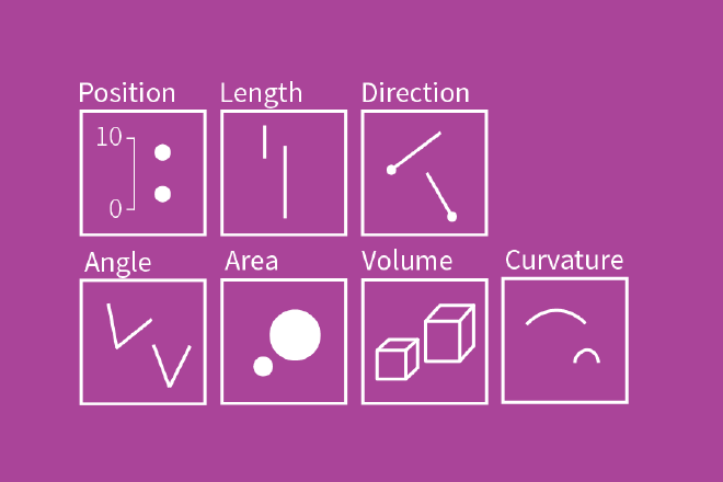
The fact is that simpler charts result in fewer interpretation errors (see Cleveland & McGill’s hierarchy). Position, length, and direction are the easiest visual information to interpret. Volume and curvature tend to be fairly difficult. Dot plots and bar charts are just easier to read than area charts and other more complex visualizations.

Obviously we don’t want everything to be a bar chart, but if your viz isn’t working for your audience it’s time to take a step back and consider alternatives.
Ask others. #
It’s usually a good idea to ask someone else to interpret your visualization before releasing it out into the world. What is their main takeaway?
If it’s not the message you wanted, you still have some work to do.
Workshop different approaches and get early feedback from the intended audience if possible.
Join a data viz community to get the best feedback. There’s lots of people out there willing to help – us included!
